Every name a screener returns looks convincing. Three checks that take about a minute each will tell you which ones actually are, including one that produces a number in five seconds.
This article is based on webinar, made by TradeVision team and Goat Academy mentors on 20 Aug 2026. TradeVision is AI platform, created to analyze option chains and hard strategies, make decisions based on the Dark Pool excerptions and set of organized screeners.
Rule of thumb
This is a text that I added to test the saved state. Not sure what I do wrong (maybe the page saved from the cache?)
A stock screener returns candidates, not conclusions. To verify a result, check three things:
- whether the sector is genuinely leading by looking at its ETF rather than one day of colour,
- whether the stock is outperforming the index using Mansfield Relative Strength
- whether it is making new highs or just sitting near an old one.
Run a prompt asking for strong stocks in leading sectors and you will get a list. Every name on it will be green. It will look convincing.
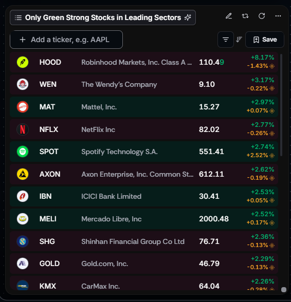
Then you open the charts and find that one of them is genuinely leading its sector at new highs, and another is in a sector that has been red for a week, sitting well below its old highs, and has no business being on a list of strong stocks at all.
Both came back from the same prompt. That is not a broken screener, it is how screening works. The list is where the research starts.
This is the verification process I walked through in a recent session on our regular webinar channel: https://www.youtube.com/@itstradevision
The investing problem, in one example
The prompt was:
find me strong stocks in leading sectors
Four names worth comparing came back.
- $IOVA was up 12% on the day, in biotechnology, making new highs. Healthcare had been moving for weeks. That one held up under every check.
- $CBOE was in the finance sector and had not made new highs in some time. On the same list, from the same prompt, and a completely different quality of candidate.
- $CarMax looked strong on its own chart but sat in consumer durables, which was red that day.
- $Goosehead Insurance was up 3% after a strong three-month run, also finance.
Same prompt, four very different answers. Without checking, you would treat all four as equivalent.
TradeVision check one: is the sector actually leading?
The mistake here is judging a sector by one day of colour on a heat map.
When I looked at finance on the heat map, most tiles were red and the obvious conclusion was that the prompt had failed. But pulling up XLF, the financial sector ETF, showed something different: it was down that day, and it had been making new highs for the previous two weeks.
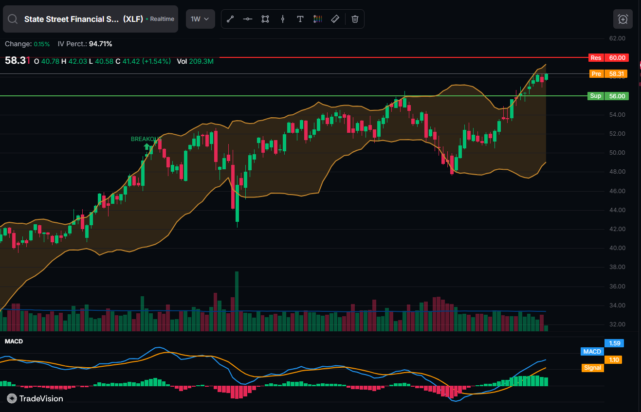
Red today, leading this month. Those are not the same statement, and only one of them matters for a swing trade.
The practical version:
Heat map for today, which is useful for intraday and for spotting rotation as it happens
Sector ETF chart for the trend, which is what tells you whether a sector is genuinely leading.
The main sector ETFs worth having to hand (grab it for free):
| Sector | ETF |
| Financials | XLF |
| Consumer discretionary | XLY |
| Technology | XLK |
| Healthcare | XLV |
| Energy | XLE |
| Industrials | XLI |
| Consumer staples | XLP |
Running the same check on consumer discretionary using $XLY produced a different answer again: mostly sideways, no clear uptrend. So $CarMax looked strong on its own chart while its sector was going nowhere. That is not a disqualification, but it is a materially weaker setup than a strong stock inside a strong sector, and you would want to know which one you were buying.

TradeVision check two: is it outperforming, and by how much?
This is where MRSI does the work, and it is the fastest of the three checks because it produces a number.
Mansfield Relative Strength compares a stock to a benchmark, usually the S&P 500, and plots the result around a zero line. Above zero means outperforming. Below means lagging.
Two readings from the session make the point better than the theory does.
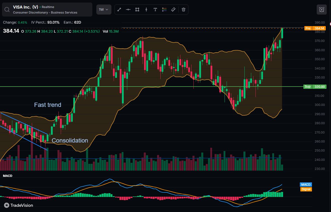
$Visa came back at +2.14. Positive, so technically outperforming, but only just. Checking the line's recent history showed it had been sitting at zero three or four days earlier. It was outperforming that day largely because it was flat while the S&P fell. Defensive strength rather than genuine leadership.
Exxon Mobil came back at +8.17. Same benchmark, same scale, a completely different reading. Considerably more volatile, and considerably further ahead of the index.
Both would appear on a list of stocks outperforming the S&P 500. The screener is not wrong about either. But +2.14 and +8.17 describe two different situations, and the number tells you which one you are looking at in about five seconds.
What to look for:
- Above zero and rising is the condition you want
- Just above zero often means the index fell rather than the stock rose. Check whether the line has been positive for weeks or only for days
- High and rising means real leadership, usually with more volatility attached
TradeVision check three: new highs, or just near an old one?
"Near the 52-week high" sounds stronger than it often is.
A community prompt in the session asked for stocks in hot industries near their 52-week high. One result was trading around 129$ against a prior high closer to 194$. Technically near a 52-week high, given where the range sat. Nowhere near its actual highs.
$TSM, from the same list, was genuinely close to its highs in a sector that had been strong for months. Same prompt again, same gap in quality.
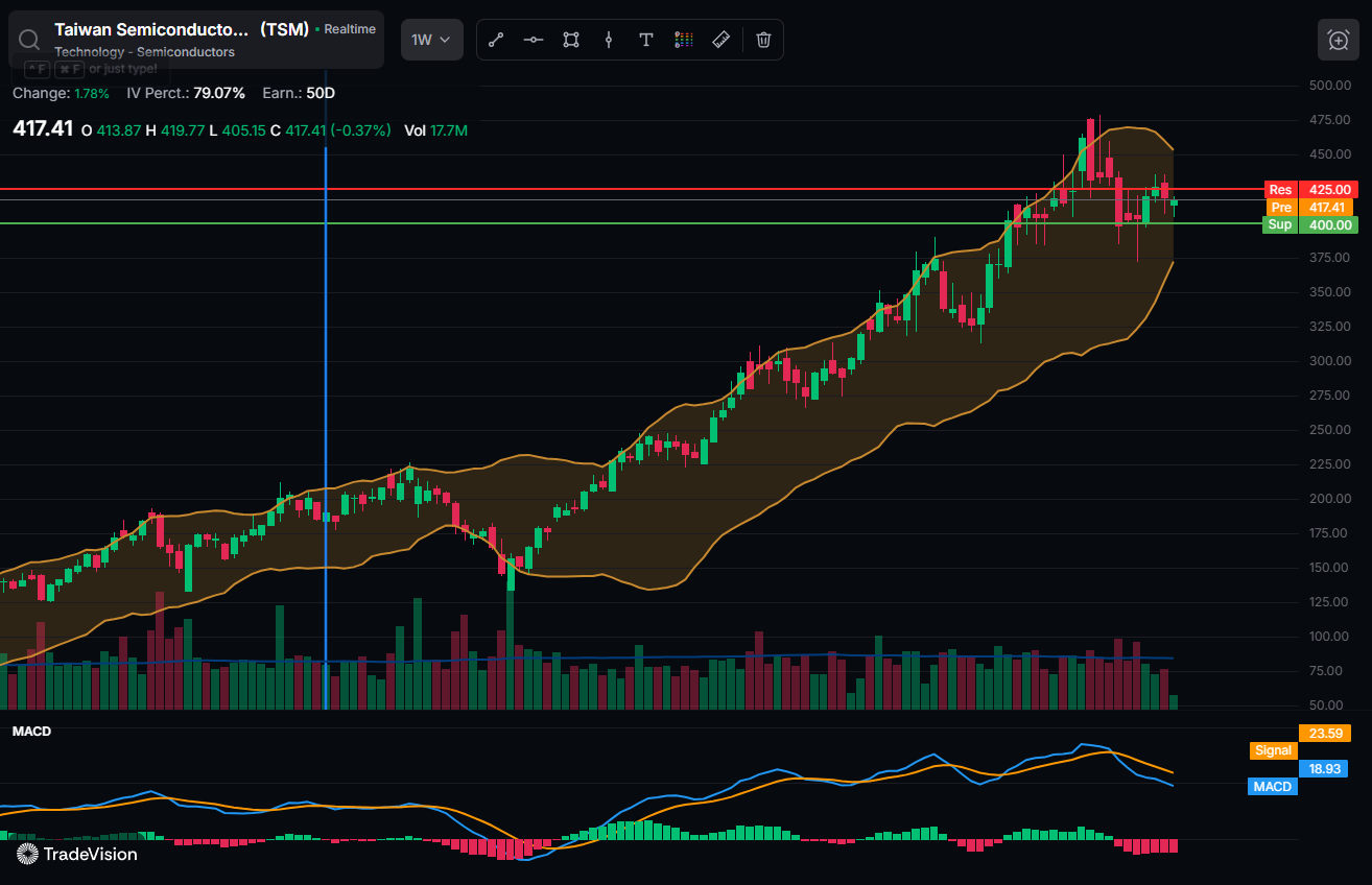
Worth separating three things that get used interchangeably:
- All-time high, no overhead resistance at all
- 52-week high, no resistance from the past year but possibly plenty above that
- Near a 52-week high, which depends entirely on how wide the year's range has been
Pull the chart out to one year, then to max. Overhead resistance you cannot see is still overhead resistance.
When the TradeVision screener returns nothing
One prompt in the session came back empty:
find stocks where the 50 MA is crossing above the 150 MA
No results. That is worth knowing, because an empty result is ambiguous in a way most people misread. It can mean genuinely nothing matched, that the phrasing was not understood, or that the prompt was filtered against a watchlist too narrow to contain a match.
The fix is the same in all three cases. Broaden the prompt, use full words rather than acronyms, and sort the larger result set yourself.
Checking the previous session's names
The same three checks apply to positions you already hold, and the honest version is more useful than the highlight reel.
Four names found by prompting several weeks earlier:
- $BBVA was still making higher highs. The one that worked
- $CHEF had been consolidating since its breakout, neither working nor failing
- $QUAD had made no new highs since early August, also consolidating
- Rocky Brands had dropped back below its support level around 47.69, made a new low, and shown no strength since.
One out of four clearly working, two undecided, one that had stopped working. That is a normal distribution of outcomes and it is why the exit rules matter as much as the entry.
On Rocky Brands specifically, my point was that anyone using a basic support line as their stop would already have been taken out for a small loss, which is the system working rather than failing. There is no single correct stop placement. A wider stop rides out noise and risks more, a tighter stop protects capital and gets shaken out more often. Common approaches:
- ATR-based stop,
- Moving average
- Support level itself.
Practical terms from AI Labs
A few things from the session worth knowing.
- Workspaces. You can create separate workspaces and delete them, which makes it easy to start clean rather than working around cards left over from last week.
- Widgets. A watchlist widget is where you type the prompt. Results can be sorted by ticker, percentage change, price or market cap. Right-clicking a result gives you the option of a new chart card inside the workspace, or the full chart view.
- Credits. Standard accounts include a set number of AI Labs credits. If you run out, support can help.
- Mobile. AI Labs works in a mobile browser but is not yet in the app. If you are on a phone or tablet, open the site rather than the app.
The takeaway
A screener narrows thousands of stocks down to a handful. That is genuinely valuable and it is not the same as telling you which ones are worth trading.
Three checks, roughly a minute each. Is the sector actually leading, is the stock actually outperforming, and is it actually at highs. Most candidates fail at least one, and finding that out before you enter is the entire point of running them.
This article is for educational purposes only and is not financial advice. Any tickers mentioned were used to demonstrate a research process and are not recommendations to buy or sell. TradeVision does not execute trades, hold client funds, or provide investment recommendations. Trading involves risk of loss. Questions? Reach us at [email protected].


