An AI stock screener takes a plain-English prompt instead of filter boxes. You describe what you want, such as stocks moving above resistance in a sector, and it returns a list.
Brett ran a live session this week on a single question:
how do you find where money is moving, and then find individual stocks inside that.
The session is worth writing up for one reason in particular. The screener got some of it wrong, live, and rather than cut around it I show the misses and explain how to work with them. That is the part most guides to AI screening leave out, so it is the part we have led with here.
The Three-Step Workflow
The method has three stages, and the order matters.
- Heat map to see which sectors are moving today
- AI Labs to find individual stocks inside the sector that stands out
- Chart to check every result before it counts as anything
Most of the value is in step three. The first two produce candidates. Only the third produces a decision.
Step One: Read the Heat Map
The heat map plots the whole market by sector, visually.
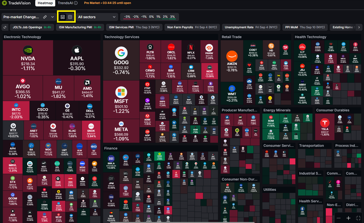
On the day of the session, technology services was the strongest block on the map, close to entirely green. Electronic technology was mixed. Producer manufacturing and energy minerals were lagging.
One point worth repeating, because it changes what you do next. If you are trading momentum you want the green sectors. If you are looking for pullbacks, you want the red ones. Same map, opposite reading, and you need to know which one you are doing before you start.
There is also a detail worth watching inside a strong sector: individual stocks that are not keeping up with it. I flag one name sitting flat while everything around it was green. A stock lagging its own sector on a strong day is telling you something.
Monosize gives every sector equal area, which is useful when you want to compare sector performance without size distorting the picture.
Market cap size scales each sector by its actual weight. Switch to it and electronic technology takes up roughly a quarter of the screen, because Nvidia, Apple and the other megacaps sit inside it. As Brett put it, when that block turns green or red it moves the whole S&P 500 with it.
Step Two: Prompt the Screener
AI Labs takes plain language rather than filter boxes.
The first prompt of the session was:
show me stocks moving above resistance in the technology services sector
It returned
"no rows matched the selected watch list."
The second attempt was deliberately broader:
show me strong stocks in technology
That one returned a full list.
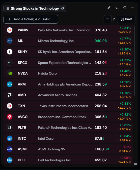
The lesson there is not that the first prompt was badly written. It is that a prompt is filtered against whichever watchlist the widget is pointed at, so a narrow prompt against a narrow list can legitimately return nothing. Start broader than you think you need, then sort and filter the results yourself.
Once results are in, sort by percentage change. I sort the list and skipped past the names that were down on the day, since the entire point of the exercise was finding strength.
Step Three: Check Every Result on the Chart
This is where the session got useful, because several results did not survive the chart check.
One name ($SPCX) had only been listed a short time, so there was not enough price history for a 50 or 200 day moving average to calculate. Only the 20 was available. Thin data is not a reason to discard a chart, but it is a reason to know what you are not seeing.
Another had already run a long way and was sitting directly underneath a resistance level around 175. Brett's read was that he would leave it alone, not because the chart was weak but because the entry was in the worst possible place, right into resistance and not yet at new highs.
A third was, in his words, consolidation rather than a trend. Nothing to act on.
Out of a full screen, most names did not survive contact with the chart. That is the normal outcome and it is what the third step is for.
Where the Screener Got It Wrong
A viewer suggested a simple prompt:
stocks above the 50 SMA
The screener returned a list. I check the first result on the chart and it was below the 50 day moving average. So was the second. Checking through the list, roughly one in four was actually above it.
He then reprompted using the full words rather than the acronym:
stocks above the 50 moving average
That returned a different set of results, some correct, some still not.
Two things to take from this.
- Verify every result. A natural-language screener is a candidate generator, not a source of truth. If a prompt says above the 50 moving average, open the chart and confirm the stock is above the 50 moving average. This takes seconds and it is not optional.
- Write prompts in full words. Acronyms like SMA are ambiguous. Spelling out "simple moving average" or "50 day moving average" gives the model less room to misread you. It also helps to name the timeframe, since a stock can be under its 50 day average and above its 50 week average at the same time, which is exactly what happened during the session.
An earlier prompt from a viewer worked considerably better:
stocks with backlog greater than 500 million trading near the 150 SMA
Every name that came back was in fact near its 150 day moving average. Interestingly, they were mostly beaten-down names rather than breakouts, which is a reminder that "near a moving average" does not specify from which direction.
Where the Support and Resistance Levels Come From
One detail from the session is easy to miss and worth knowing.

The automatic support and resistance levels that appear at the bottom of a TradeVision (tradevision.io) chart are not drawn from price history. They are calculated from the options chain, specifically from where open interest is concentrated across strikes. Those concentrations are the call wall and the put wall.
That is why the levels do not appear on every stock. A ticker needs enough options open interest for the calculation to mean anything. When they do appear, they are showing you where options positioning is dense enough to influence price, which is a different signal from a line drawn across previous highs.
This article is for educational purposes only and is not financial advice. Any tickers mentioned were used to demonstrate a research process and are not recommendations to buy or sell. TradeVision is a research platform and does not execute trades, hold client funds, or provide investment recommendations. Users trade through their own broker. Trading involves risk of loss. Questions? Reach us at [email protected].