
Mansfield Relative Strength Index
It measures whether a stock is outperforming or underperforming a benchmark, usually the S&P 500.
When the MRSI line is above zero, the stock is beating the market. Below zero, it is lagging behind it.
MRSI is not the same as RSI, which measures a single stock's own momentum.

A stock can go up and still be a bad trade.
If a stock rises 8% in a quarter while the S&P 500 rises 15%, the position made money and lost ground at the same time. Money moved into that name slower than it moved into the market as a whole. Buy enough of those and a portfolio quietly underperforms an index fund while feeling like it is working. This is called negative Alpha.
Mansfield Relative Strength is the indicator that makes this visible. It is one of the few tools on a chart that answers a question price alone cannot: not is this stock going up, but is this stock going up faster than everything else.
What MRSI means
MRSI is short for Mansfield Relative Strength Index. You will also see it written as Mansfield RS, Mansfield Relative Strength, or MRS. They all refer to the same indicator.
It plots one number: how a stock is performing against a benchmark index, measured against that stock's own performance over the past year.
The line oscillates around a zero line.
- Above zero: the stock is outperforming the benchmark
- Below zero: the stock is underperforming the benchmark
- Crossing zero: the relationship is changing, which is usually the part worth paying attention to
That is the whole idea. Everything else is detail about how the number is built and how not to misread it.
Where the name comes from
MRSI comes out of Stan Weinstein's 1988 book Secrets for Profiting in Bull and Bear Markets, still one of the most widely read books on stage-based trend analysis.

The name causes confusion, because there is no trader called Mansfield. Weinstein did not invent an indicator and name it after himself or a colleague. The charts he used throughout the book came from the Mansfield chart service, a chart provider that no longer exists. The relative strength line printed on those charts became known by the name of the service that printed it, and the name stuck long after the company was gone.
Weinstein himself simply called it relative strength. He defined it on page 18:
"How a given stock (or group) acts in relation to the overall market. For instance, if stock XYZ rallies 10 percent while the market moves ahead 20 percent, that's poor relative strength even though the stock has advanced. On the other hand, if stock XYZ declines 10 percent while the market averages decline 20 percent, that's favorable relative strength even though the stock has moved lower."
That second sentence is the part most traders skip. Favourable relative strength does not require the stock to go up. In a falling market, the stocks that fall least are the ones that tend to lead the next advance. MRSI is one of the few indicators that will show you that while it is happening.
How MRSI is calculated
Step one, the raw relative performance line:
RP = (stock close ÷ index close) × 100
That ratio on its own is not very readable. Its absolute value depends on the stock's price, so a $400 stock and a $12 stock produce numbers that cannot be compared.
Step two, normalise it against its own history:
MRSI = ((RP today ÷ SMA of RP over N periods) − 1) × 100
*Where N is 52 on a weekly chart and 200 on a daily chart, matching roughly one year of data either way.
That second step is what turns the raw ratio into an oscillator. It reads the current relative performance against the stock's own average relative performance over the past year, so the zero line is not an arbitrary level. It is the stock's own one-year normal.
A worked example with round numbers:
- Stock trades at $50, index trades at 5,000
- RP = (50 ÷ 5,000) × 100 = 1.00
- The 52-week average of RP has been 0.95
- MRSI = ((1.00 ÷ 0.95) − 1) × 100 = +5.26
A reading of +5.26 means the stock's performance relative to the index is currently 5.26% above where it has averaged over the last year. The stock has been pulling ahead of the market recently, compared to its own baseline.
How to read the line
The zero line is the signal, not the number. Most of the useful information is in crossings and slope, not in the absolute value.
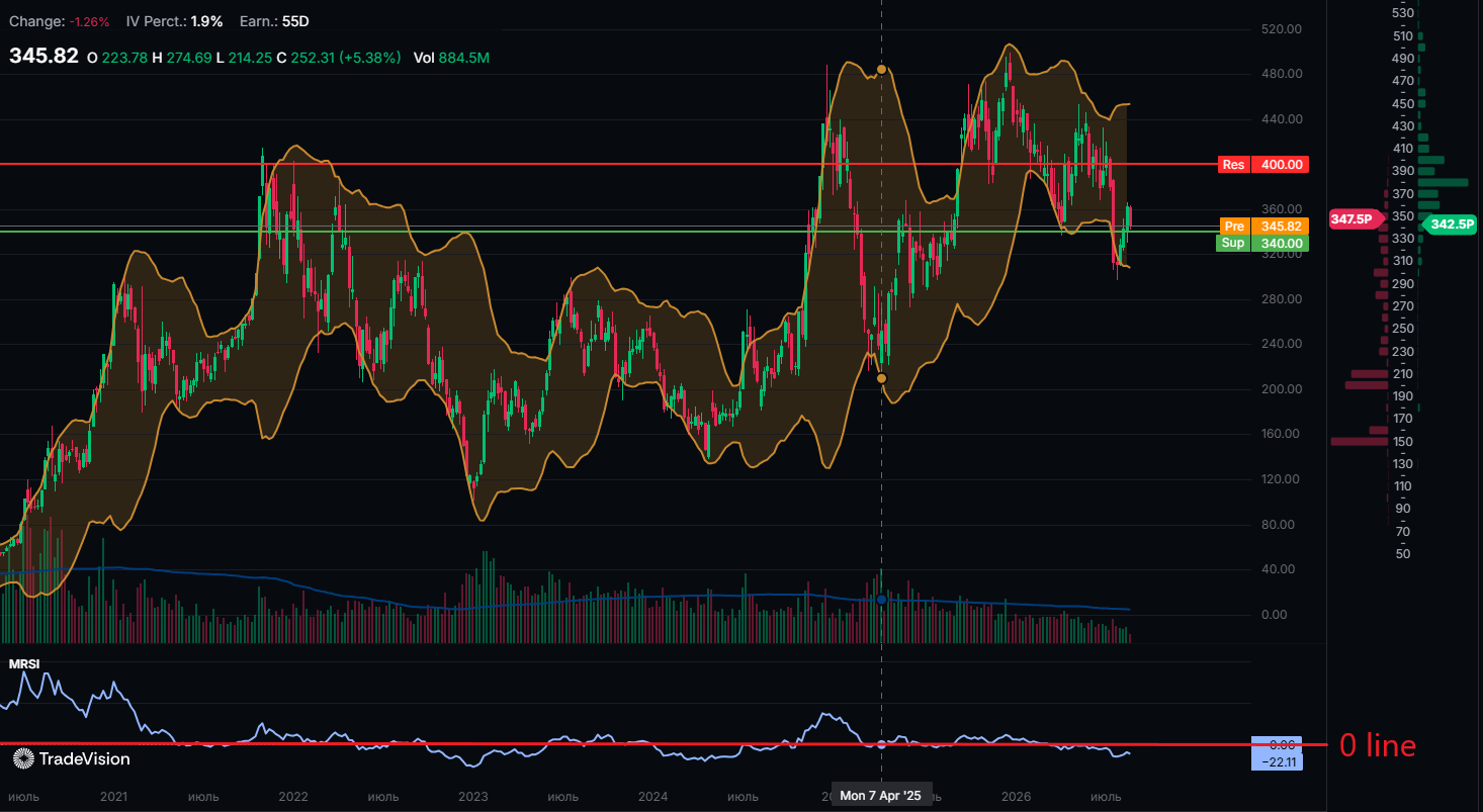
Above zero and rising. The stock is beating the market and the gap is widening. This is what Weinstein wanted to see in an established uptrend.
Above zero but falling. The stock is still ahead of the market but losing its edge. Often the first warning that leadership is rotating elsewhere, and it usually shows up before price itself breaks down.
Below zero and falling. The stock is behind the market and falling further behind. In Weinstein's framework this is the condition that disqualifies a name from consideration, regardless of how attractive the story is.
Below zero but rising. The stock still lags, but the gap is closing. This is the setup worth watching. A stock that crosses from below zero to above zero while price breaks out of a base is the classic Weinstein confirmation.
Sitting flat around zero. The stock is moving with the market. There is no relative edge in either direction, which for a trend trader is a reason to look elsewhere.
Five ways people misread MRSI
1. Treating it like an overbought and oversold oscillator. MRSI has no upper or lower bound. There is no level at which it is "too high." A reading of +18 does not mean sell. It means the stock is a long way ahead of the market, which is usually the point.
2. Comparing MRSI values across different stocks. Because each stock's MRSI is normalised against its own one-year average, +6 on one stock and +6 on another do not mean the same thing. MRSI ranks a stock against its own history, not against other stocks. Use it to judge one name over time, not to sort a watchlist.
3. Using weekly settings on a daily chart. The default is 52 periods on weekly and 200 on daily. Running 52 on a daily chart gives you a roughly ten-week lookback and a much noisier line that crosses zero constantly.
4. Leaving the benchmark on autopilot. The S&P 500 is the sensible default for large caps. For a small-cap biotech, comparing against the Russell 2000 or a sector ETF says something quite different, and often more useful. The indicator is only as relevant as the thing you are comparing to.
5. Using it alone. It is a confirmation tool. On its own it will keep you in leaders and out of laggards, but it will not tell you where to enter, where to place a stop, or how much to size. Weinstein paired it with the 30-week moving average and volume for exactly that reason.
How to add MRSI in TradeVision
TradeVision (tradevision.io) includes MRSI in the chart indicator panel, benchmarked to the S&P 500 by default.
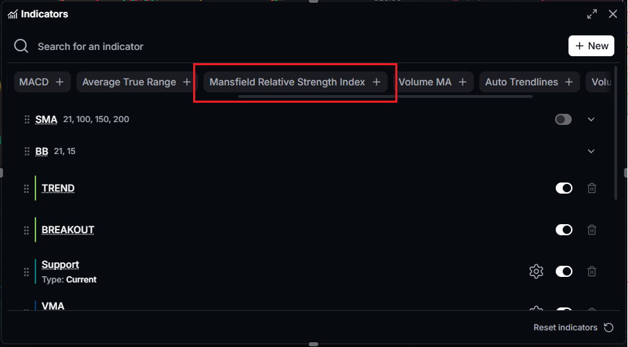
- Open any stock chart from the screener or the search bar: https://www.tradevision.io/charts/
- Open the Indicator Panel on the chart toolbar
- Select MRSI
The indicator plots in a pane below price with the zero line marked, so the crossings are readable at a glance.
Two things worth doing once it is on the chart.
Switch to a weekly timeframe first, since that is the timeframe the indicator was designed around and the one where the zero-line crossings mean the most.
Add a 30-week moving average to the price pane, so you can see the two Weinstein conditions together rather than checking them separately.
The takeaway
MRSI answers a question that price charts do not: is this stock actually leading, or just going along with the market. Above zero and rising means leading. Below zero means the money is going somewhere else.
It will not time an entry for you and it was never meant to. What it does is keep you in the names the market is favouring and out of the ones it is quietly abandoning, and over a full cycle that filter matters more than most of what a chart can tell you.
This article is for educational purposes only and is not financial advice. TradeVision does not execute trades, hold client funds, or provide investment recommendations. Trading involves risk of loss. Questions? Reach us at [email protected].


